[fusion_builder_container hundred_percent=”no” hundred_percent_height=”no” hundred_percent_height_scroll=”no” hundred_percent_height_center_content=”yes” equal_height_columns=”no” menu_anchor=”” hide_on_mobile=”small-visibility,medium-visibility,large-visibility” class=”” id=”” background_color=”rgba(96,125,139,0)” background_image=”” background_position=”center center” background_repeat=”no-repeat” fade=”no” background_parallax=”none” enable_mobile=”no” parallax_speed=”0.3″ video_mp4=”” video_webm=”” video_ogv=”” video_url=”” video_aspect_ratio=”16:9″ video_loop=”yes” video_mute=”yes” video_preview_image=”” border_size=”” border_color=”” border_style=”solid” margin_top=”” margin_bottom=”” padding_top=”” padding_right=”” padding_bottom=”” padding_left=””][fusion_builder_row][fusion_builder_column type=”1_1″ layout=”1_1″ spacing=”” center_content=”no” link=”” target=”_self” min_height=”” hide_on_mobile=”small-visibility,medium-visibility,large-visibility” class=”” id=”” background_color=”” background_image=”” background_position=”left top” background_repeat=”no-repeat” hover_type=”none” border_size=”0″ border_color=”” border_style=”solid” border_position=”all” padding_top=”” padding_right=”” padding_bottom=”” padding_left=”” dimension_margin=”” animation_type=”” animation_direction=”left” animation_speed=”0.3″ animation_offset=”” last=”no”][fusion_text]
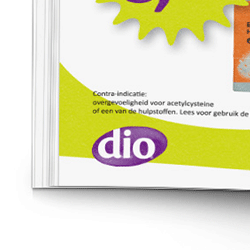
In 2010 D.I.O. Drogisterijen, a chain of pharmacists with stores throughout the Netherlands, updated their brand with a new logo and color scheme. I was asked to adapt all print and Point Of Sale (POS) material to the new style. Seeing as I would be responsible for the weekly production as well, I made use of the opportunity to make a fresh start with a set of templates for each document.
[/fusion_text][/fusion_builder_column][fusion_builder_column type=”3_4″ layout=”3_4″ spacing=”” center_content=”no” link=”” target=”_self” min_height=”” hide_on_mobile=”small-visibility,medium-visibility,large-visibility” class=”” id=”” background_color=”#607d8b” background_image=”” background_position=”left top” undefined=”” background_repeat=”no-repeat” hover_type=”none” border_size=”0″ border_color=”” border_style=”solid” border_position=”all” padding_top=”” padding_right=”” padding_bottom=”” padding_left=”” margin_top=”” margin_bottom=”” animation_type=”” animation_direction=”left” animation_speed=”0.3″ animation_offset=”” last=”no”][fusion_imageframe image_id=”460″ style_type=”none” stylecolor=”” hover_type=”none” bordersize=”” bordercolor=”” borderradius=”” align=”none” lightbox=”no” gallery_id=”” lightbox_image=”” alt=”” link=”” linktarget=”_self” hide_on_mobile=”small-visibility,medium-visibility,large-visibility” class=”” id=”” animation_type=”” animation_direction=”left” animation_speed=”0.3″ animation_offset=””]http://www.jeroenzi.jp/wp-content/uploads/2018/08/DIO-krant-MockUp2.jpg[/fusion_imageframe][/fusion_builder_column][fusion_builder_column type=”1_4″ layout=”1_4″ spacing=”” center_content=”no” link=”” target=”_self” min_height=”” hide_on_mobile=”small-visibility,medium-visibility,large-visibility” class=”” id=”” background_color=”” background_image=”” background_position=”left top” background_repeat=”no-repeat” hover_type=”none” border_size=”0″ border_color=”” border_style=”solid” border_position=”all” padding_top=”” padding_right=”” padding_bottom=”” padding_left=”” dimension_margin=”” animation_type=”” animation_direction=”left” animation_speed=”0.3″ animation_offset=”” last=”no”][fusion_text]
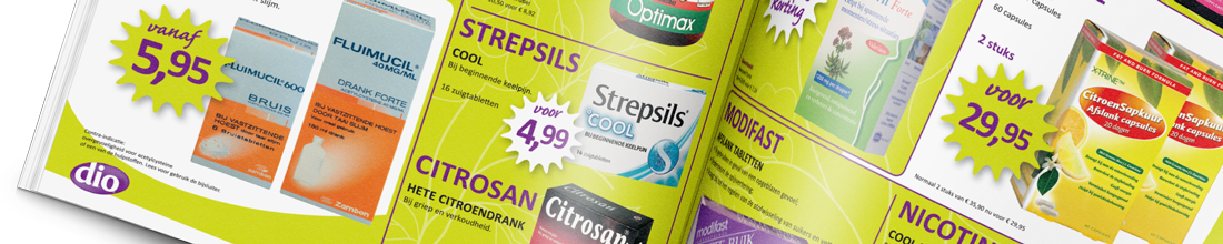
I prepared template documents for each piece of POS material, starting with the folder. I started out with blank templates for each page and each variation of spread. Each bit of text was linked to a paragraph style. Through consistent use of these paragraph styles in all regular POS material, it became very easy to quickly copy and paste product info from one document into another.
[/fusion_text][/fusion_builder_column][/fusion_builder_row][/fusion_builder_container][fusion_builder_container hundred_percent=”no” hundred_percent_height=”no” hundred_percent_height_scroll=”no” hundred_percent_height_center_content=”yes” equal_height_columns=”no” menu_anchor=”” hide_on_mobile=”small-visibility,medium-visibility,large-visibility” class=”” id=”” background_color=”rgba(221,221,221,0)” background_image=”” background_position=”center center” background_repeat=”no-repeat” fade=”no” background_parallax=”none” enable_mobile=”no” parallax_speed=”0.3″ video_mp4=”” video_webm=”” video_ogv=”” video_url=”” video_aspect_ratio=”16:9″ video_loop=”yes” video_mute=”yes” video_preview_image=”” border_size=”” border_color=”” border_style=”solid” margin_top=”” margin_bottom=”” padding_top=”” padding_right=”” padding_bottom=”” padding_left=””][fusion_builder_row][fusion_builder_column type=”1_1″ layout=”1_1″ spacing=”” center_content=”no” link=”” target=”_self” min_height=”” hide_on_mobile=”small-visibility,medium-visibility,large-visibility” class=”” id=”” background_color=”” background_image=”” background_position=”left top” background_repeat=”no-repeat” hover_type=”none” border_size=”0″ border_color=”” border_style=”solid” border_position=”all” padding_top=”” padding_right=”” padding_bottom=”” padding_left=”” dimension_margin=”” animation_type=”” animation_direction=”left” animation_speed=”0.3″ animation_offset=”” last=”no”][fusion_title margin_top=”” margin_bottom=”” hide_on_mobile=”small-visibility,medium-visibility,large-visibility” class=”” id=”” size=”2″ content_align=”left” style_type=”none” sep_color=”#ff9800″]
Example of template document
[/fusion_title][fusion_imageframe image_id=”457″ style_type=”none” stylecolor=”” hover_type=”none” bordersize=”” bordercolor=”” borderradius=”” align=”none” lightbox=”no” gallery_id=”” lightbox_image=”” alt=”” link=”” linktarget=”_self” hide_on_mobile=”small-visibility,medium-visibility,large-visibility” class=”” id=”” animation_type=”” animation_direction=”left” animation_speed=”0.3″ animation_offset=””]http://www.jeroenzi.jp/wp-content/uploads/2018/08/folder_layouts2.jpg[/fusion_imageframe][/fusion_builder_column][/fusion_builder_row][/fusion_builder_container][fusion_builder_container hundred_percent=”no” hundred_percent_height=”no” hundred_percent_height_scroll=”no” hundred_percent_height_center_content=”yes” equal_height_columns=”no” menu_anchor=”” hide_on_mobile=”small-visibility,medium-visibility,large-visibility” class=”” id=”” background_color=”” background_image=”” background_position=”center center” background_repeat=”no-repeat” fade=”no” background_parallax=”none” enable_mobile=”no” parallax_speed=”0.3″ video_mp4=”” video_webm=”” video_ogv=”” video_url=”” video_aspect_ratio=”16:9″ video_loop=”yes” video_mute=”yes” video_preview_image=”” border_size=”” border_color=”” border_style=”solid” margin_top=”” margin_bottom=”” padding_top=”” padding_right=”” padding_bottom=”” padding_left=””][fusion_builder_row][fusion_builder_column type=”1_1″ layout=”1_1″ spacing=”” center_content=”no” link=”” target=”_self” min_height=”” hide_on_mobile=”small-visibility,medium-visibility,large-visibility” class=”” id=”” background_color=”” background_image=”” background_position=”left top” background_repeat=”no-repeat” hover_type=”none” border_size=”0″ border_color=”” border_style=”solid” border_position=”all” padding_top=”” padding_right=”” padding_bottom=”” padding_left=”” dimension_margin=”” animation_type=”” animation_direction=”left” animation_speed=”0.3″ animation_offset=”” last=”no”][fusion_separator style_type=”single|dotted” hide_on_mobile=”small-visibility,medium-visibility,large-visibility” class=”” id=”” sep_color=”#ff9800″ top_margin=”20″ bottom_margin=”20″ border_size=”” icon=”” icon_circle=”” icon_circle_color=”” width=”” alignment=”center” /][fusion_title margin_top=”” margin_bottom=”” hide_on_mobile=”small-visibility,medium-visibility,large-visibility” class=”” id=”” size=”2″ content_align=”left” style_type=”none” sep_color=”#ff9800″]
Typography
[/fusion_title][/fusion_builder_column][fusion_builder_column type=”1_4″ layout=”1_4″ spacing=”” center_content=”no” link=”” target=”_self” min_height=”” hide_on_mobile=”small-visibility,medium-visibility,large-visibility” class=”” id=”” background_color=”” background_image=”” background_position=”left top” background_repeat=”no-repeat” hover_type=”none” border_size=”0″ border_color=”” border_style=”solid” border_position=”all” padding_top=”” padding_right=”” padding_bottom=”” padding_left=”” dimension_margin=”” animation_type=”” animation_direction=”left” animation_speed=”0.3″ animation_offset=”” last=”no”][fusion_text]
Careful and consistent use of paragraph styles ensured that once the folder was finished, I was able to easily copy and paste product information from the folder into any other document (posters, pricetags, online banners) without having to reformat each piece of text by hand. Not only was this a great timesaver, it also minimalized the risk of mistakes.
This came in especially handy a couple of months into the project, when D.I.O. drogisterijen requested a series of alternative branding styles for a seperate line of biological pharmacies. More information about that project can be found here.
[/fusion_text][/fusion_builder_column][fusion_builder_column type=”3_4″ layout=”3_4″ spacing=”” center_content=”no” link=”” target=”_self” min_height=”” hide_on_mobile=”small-visibility,medium-visibility,large-visibility” class=”” id=”” background_color=”” background_image=”” background_position=”left top” background_repeat=”no-repeat” hover_type=”none” border_size=”0″ border_color=”” border_style=”solid” border_position=”all” padding_top=”” padding_right=”” padding_bottom=”” padding_left=”” dimension_margin=”” animation_type=”” animation_direction=”left” animation_speed=”0.3″ animation_offset=”” last=”no”][fusion_imageframe image_id=”168″ style_type=”none” stylecolor=”” hover_type=”none” bordersize=”” bordercolor=”” borderradius=”” align=”none” lightbox=”no” gallery_id=”” lightbox_image=”” alt=”” link=”” linktarget=”_self” hide_on_mobile=”small-visibility,medium-visibility,large-visibility” class=”” id=”” animation_type=”” animation_direction=”left” animation_speed=”0.3″ animation_offset=””]http://www.jeroenzi.jp/wp-content/uploads/2015/03/DIO-a4-flyers02.png[/fusion_imageframe][/fusion_builder_column][/fusion_builder_row][/fusion_builder_container][fusion_builder_container hundred_percent=”no” hundred_percent_height=”no” hundred_percent_height_scroll=”no” hundred_percent_height_center_content=”yes” equal_height_columns=”no” menu_anchor=”” hide_on_mobile=”small-visibility,medium-visibility,large-visibility” class=”” id=”” background_color=”rgba(96,125,139,0)” background_image=”” background_position=”center center” background_repeat=”no-repeat” fade=”no” background_parallax=”none” enable_mobile=”no” parallax_speed=”0.3″ video_mp4=”” video_webm=”” video_ogv=”” video_url=”” video_aspect_ratio=”16:9″ video_loop=”yes” video_mute=”yes” video_preview_image=”” border_size=”” border_color=”” border_style=”solid” margin_top=”” margin_bottom=”” padding_top=”” padding_right=”” padding_bottom=”” padding_left=””][fusion_builder_row][fusion_builder_column type=”1_1″ layout=”1_1″ spacing=”” center_content=”no” link=”” target=”_self” min_height=”” hide_on_mobile=”small-visibility,medium-visibility,large-visibility” class=”” id=”” background_color=”” background_image=”” background_position=”left top” background_repeat=”no-repeat” hover_type=”none” border_size=”0″ border_color=”” border_style=”solid” border_position=”all” padding_top=”” padding_right=”” padding_bottom=”” padding_left=”” dimension_margin=”” animation_type=”” animation_direction=”left” animation_speed=”0.3″ animation_offset=”” last=”no”][fusion_separator style_type=”single|dotted” hide_on_mobile=”small-visibility,medium-visibility,large-visibility” class=”” id=”” sep_color=”#ff9800″ top_margin=”20″ bottom_margin=”20″ border_size=”” icon=”” icon_circle=”” icon_circle_color=”” width=”” alignment=”center” /][fusion_title margin_top=”” margin_bottom=”” hide_on_mobile=”small-visibility,medium-visibility,large-visibility” class=”” id=”” size=”2″ content_align=”left” style_type=”none” sep_color=”#ff9800″]
Examples of POS material
[/fusion_title][fusion_gallery image_ids=”509,510,511″ layout=”” picture_size=”” columns=”” column_spacing=”10″ hover_type=”” lightbox=”yes” lightbox_content=”” hide_on_mobile=”small-visibility,medium-visibility,large-visibility” class=”” id=”” /][/fusion_builder_column][/fusion_builder_row][/fusion_builder_container]
